

Grad showcae

Studio Iv
2025
project info
Project Background
The Vanta Grad Showcase was a collaboration with Ella Dowhaniuk to design a visual identity for the 4th year graduating Bachelor of Design Conestoga class. This project focused on creating a cohesive visual identity that reflects the theme of knowledge absorption and personal growth throughout the students' academic journey.
The project includes developing a logo, patterns, icons, typography, brand assets, photography, and promotional materials. The graduates selected the title "Vanta" to symbolize absorbing knowledge and evolving over the years of learning. This theme is expressed through a combination of textures and a modern design approach that showcases the strong foundation of design skills acquired during their studies.
Problem Statement
The challenge was to create a visual identity that symbolizes the theme of "Vanta,” the idea of absorption of knowledge, while balancing the busy texture with a Swiss-style layout.
Vision Statement
-
Create a visual identity that symbolizes the absorption of knowledge through textures and symbolic patterns.
-
Integrate traditional and digital media in the design deliverables.
-
Develop a simple yet strong logo that communicates the theme of growth and knowledge.
-
Ensure the design is visually appealing while keeping the audience in mind.
Disciplines
-
Poster design
-
Brand identity
-
Motion graphic
-
Marketing and advertising
Year
2025
Software & Tools
-
Adobe illustrator
-
Adobe photoshop
-
Adobe After Effects
-
Indesign
-
Procreate
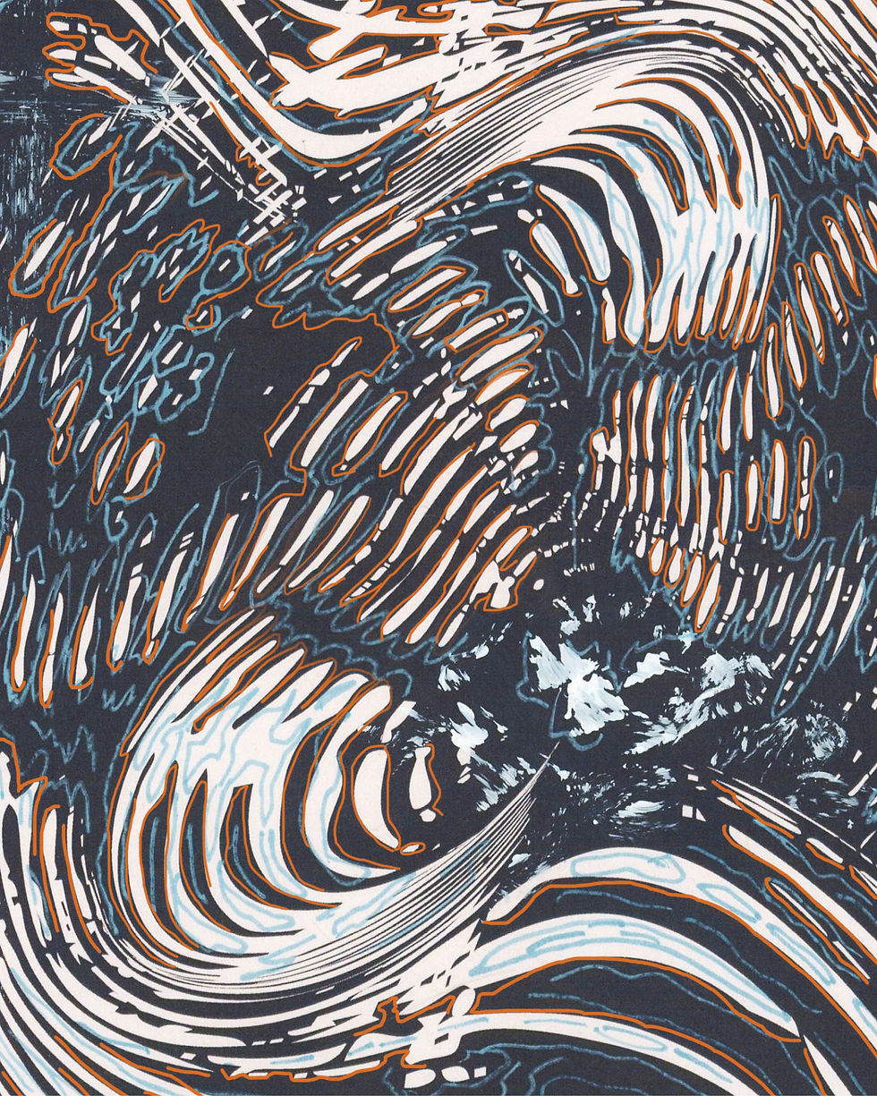
The design process began with brainstorming and developing ideas around the theme of "absorption of knowledge." We focused on creating a visual identity that explored textures through traditional paint and ink. These textures were scanned, digitized, and then layered to symbolize the accumulation of knowledge.
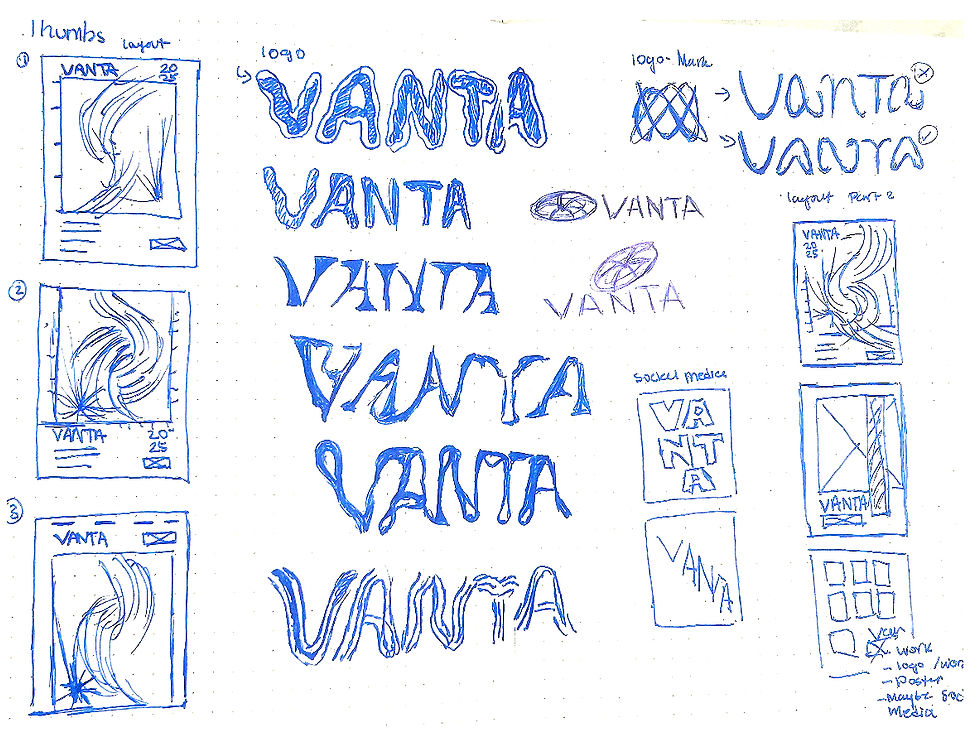
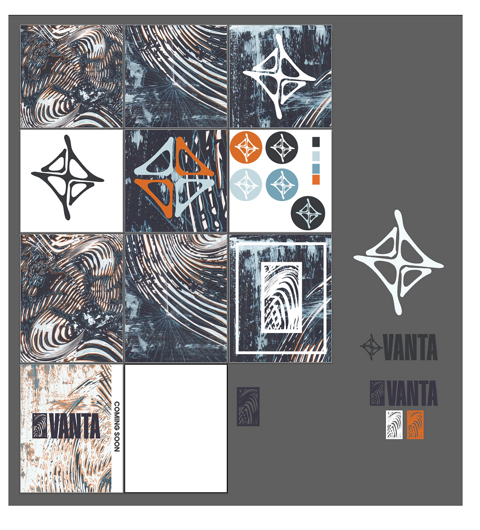
We explored various forms for the logo before settling on a simplified version of the texture motif, combined with a bold sans-serif font. The logo represents the foundation of design skills acquired over four years of study. To further reinforce the theme of growth, we used a secondary pattern inspired by a map, symbolizing progress and discovery.
Several iterations of colour palettes were tested, settling on a combination of dark grey, orange, dusty blue, light blue, and white. These colours represent creativity and knowledge, aligning with the project's core values.
The final design effectively combined traditional textures with modern digital tools to create a cohesive and visually striking identity. The logo was simplified yet powerful, representing the growth of knowledge in a clear, memorable way.
The key takeaway from this process was the importance of balancing busy design elements (textures) with clean, structured layouts. Testing and feedback helped refine the designs, ensuring the textures didn't overwhelm the viewer.






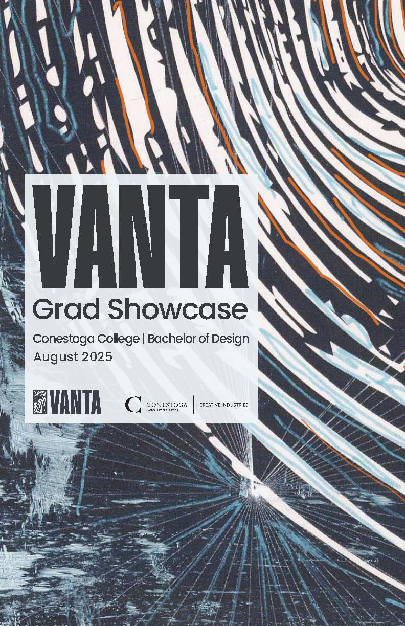
GRAD SHOWCASE POSTERS
[ Poster Series ]
GRAD SHOWCASE POSTERS
[ Poster Series ]

GRAD SHOWCASE POSTERS
[ Poster Series ]

GRAD SHOWCASE POSTERS
[ Poster Series ]

MOCK-UPS
[ Vanta Grad Showcase Posters ]

MOCK-UPS
[ Vanta Grad Showcase Posters ]

INSTAGRAM POSTS
[ Vanta’s Instagram posts ]

INSTAGRAM POSTS
[ Vanta’s Instagram posts ]

INSTAGRAM POSTS
[ Vanta’s Instagram posts ]
INSTAGRAM POSTS
[ Vanta’s Instagram posts ]

INSTAGRAM POSTS
[ Vanta’s Instagram posts ]

INSTAGRAM POSTS
[ Vanta’s Instagram posts ]

INSTAGRAM POSTS
[ Vanta’s Instagram posts ]
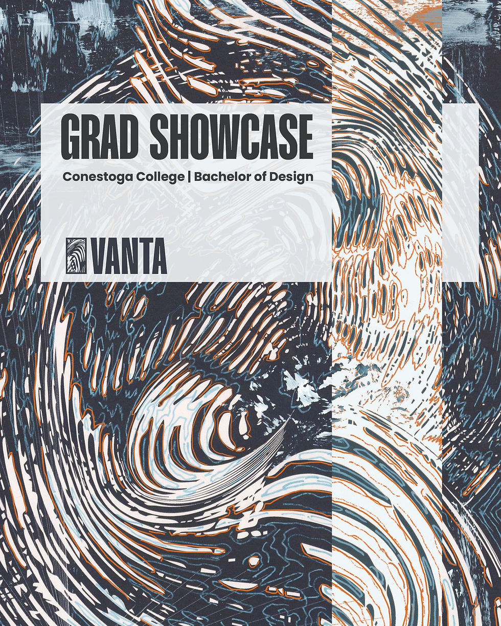
INSTAGRAM POSTS
[ Vanta’s Instagram posts ]
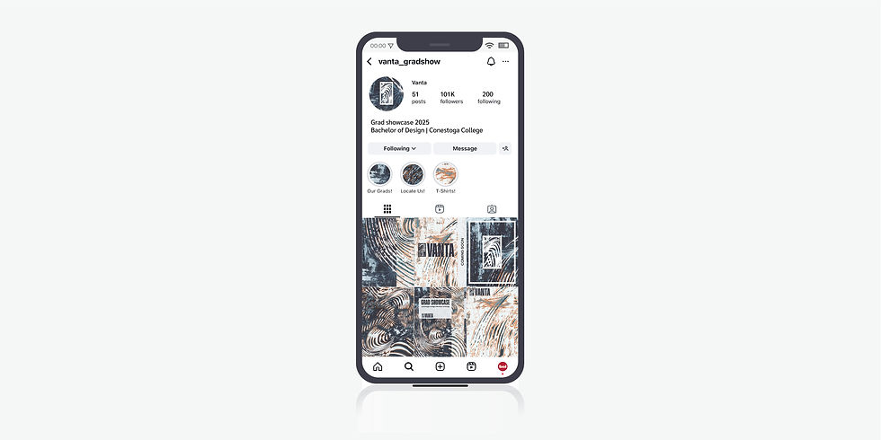
INSTAGRAM POSTS
[ Vanta’s Instagram posts ]

INSTAGRAM POSTS
[ Vanta’s Instagram posts ]

INSTAGRAM POSTS
[ Vanta’s Instagram posts ]

MOCK-UPS
[ Lanyard ]

MOCK-UPS
[ Name Tent ]

MOCK-UPS
[ Business Card ]
MOCK-UPS
[ Poster Series ]

MOCK-UPS
[ Wayfinding Posters ]

