

PACKAGING
DESIGN
STUDIO IV
PROJECT 2
project info
Project Background
Orizen is a Fictional Origami Kit Developed for Studio IV project 2 to explore packaging, branding, and sustainability. The concept invites customers to discover origami as a mindful and creative practice while celebrating the beauty of Japanese culture and art.
Problem Statement
Orizen should be an engaging and inspiring origami kit, celebrating Japanese tradition and encouraging sustainability. Creating a solution that needs to communicate calmness, creativity, and eco-consciousness while appealing to artistic audiences looking for a relaxing hobby
Vision Statement
-
Building a visual identity that reflects mindfulness, cultural connection, sustainability, and accessibility
-
Creating two packaging versions (pink sakura and yellow kiku ) with an interactive twist-fold instruction
-
Developing clear and beginner-friendly instructions to follow on a 6x6-inch paper
-
Ensuring the brand voice and design balance traditional with modern design
Disciplines
-
Packaging design
-
Graphic Tool Box
-
Physical Mock-ups
Year
2025
Research began with origami's heritage and its role as a meditative practice. The name Orizen is a blend of "Ori" (origami) and "zen," representing the focus on mindfulness of the brand.
Packaging sketches explored how to incorporate Japanese-oriented patterns into the origami.
The chosen pattern was Skaura, which are cherry blossoms representing spring's start, symbolizing softness and kindness. The other pattern is Kiku, representing the royal family, and symbolizing renewal and longevity. A twofold origami instruction paper showcases the steps to creating a crane.
Typography was carefully paired with scandria line stencil for headings, resembling the concept of origami and fankwage medium for the body text, adding warmth and personality. Colour Pleatte was refined to a red-pink for sakura and a cream yellow for kiku, aligning with the brand's mindfulness.
The final Orizen branding is elegant and reusable, using 100 % post-consumer recycled (PCW) cardstock, supporting sustainable practices. The design offers two foral patterns, which are 6 x 6 inches and instructions with a QR code for a video tutorial. The unboxing experience is interactive and rewarding as you learn how to make a crane and display it for decoration.
Software & Tools
-
Adobe Illustrator
-
Adobe Photoshop
-
Porcreate




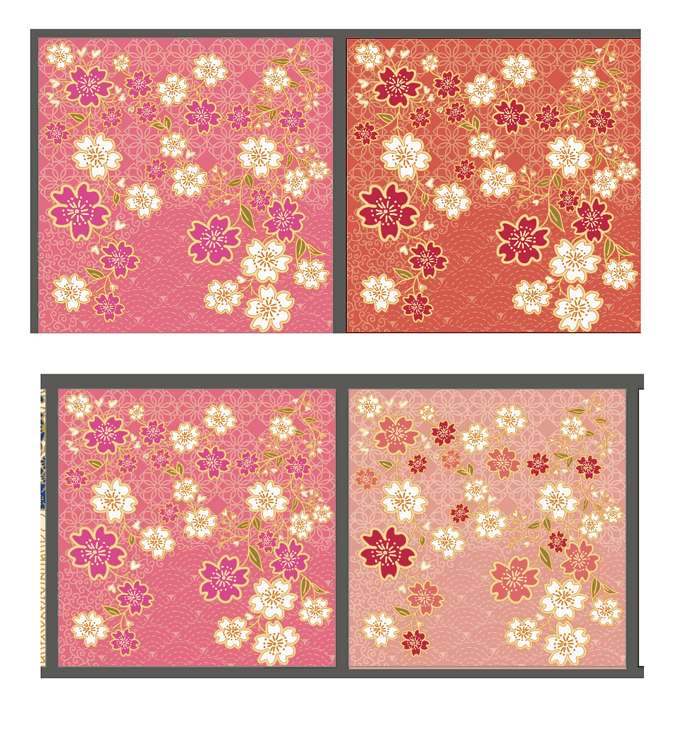


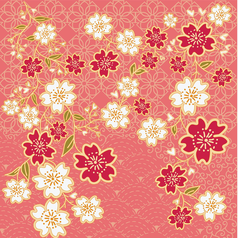
ILLUSTRATION
[ Sakura Pattern]
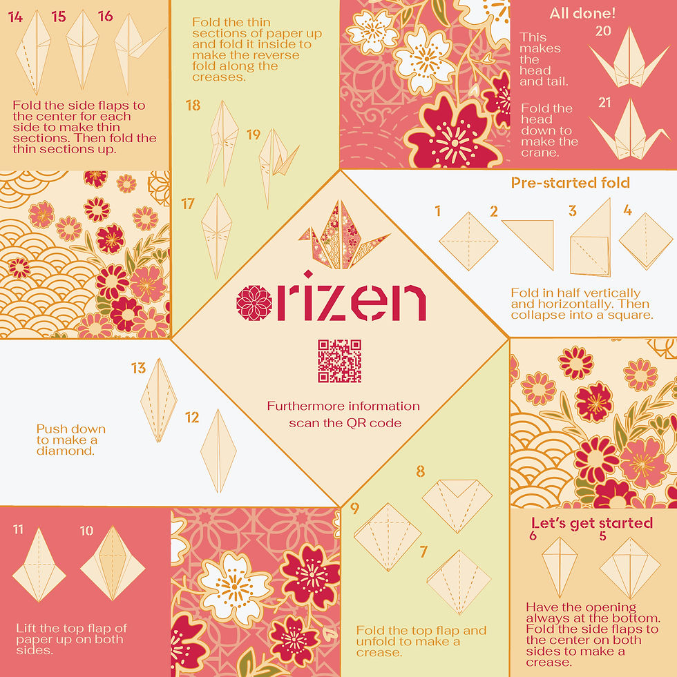
ILLUSTRATION
[English instruction]

ILLUSTRATION
[Kiku pattern]
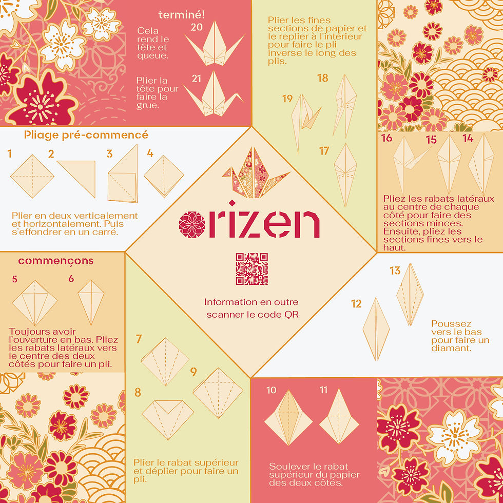
ILLUSTRATION
[French instruction]

DIE LINES
[cover box ]

DIELINES
[sakura packaging ]
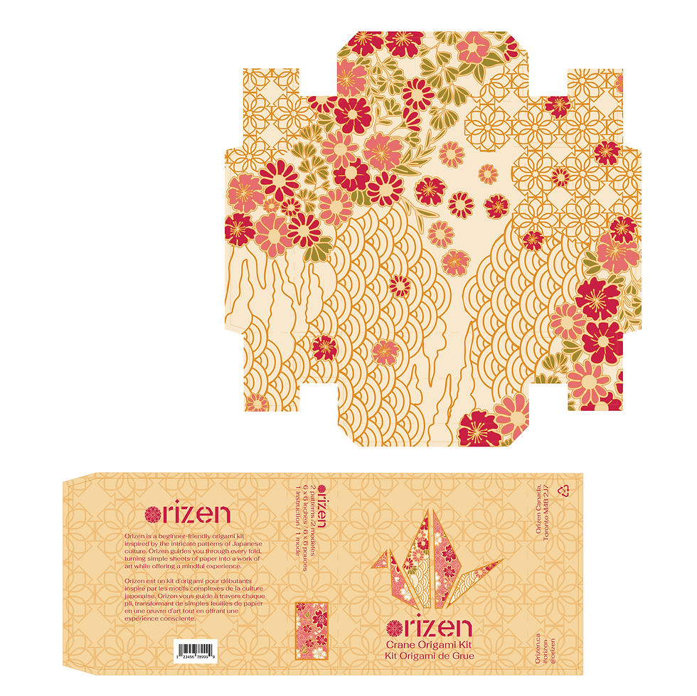
DIELINES
[kiku packaging ]
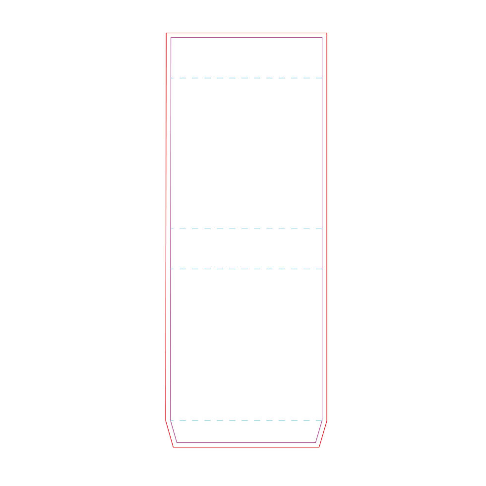
DIELINES
[box ]

COVER PACKAGE
[ Sakura box cover ]

COVER PACKAGE
[ kiku box cover ]

MOCK-UPS ORIZEN
Orizen packaging

MOCK-UPS ORIZEN
Orizen packaging

MOCK-UPS ORIZEN
Orizen packaging

MOCK-UP
[ Orizen cover package]

MOCK-UP
[ Orizen cover package]

GRAPHIC
Crane cover image for packaging

GRAPHIC TOOL BOX
Orizen guid line for branding

GRAPHIC
Orizen logo mark


